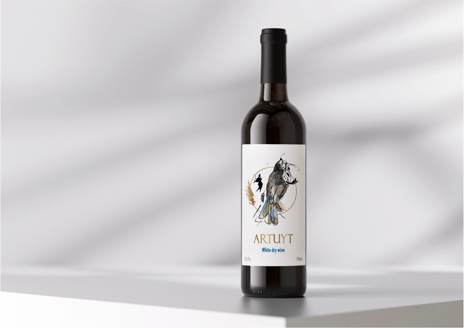
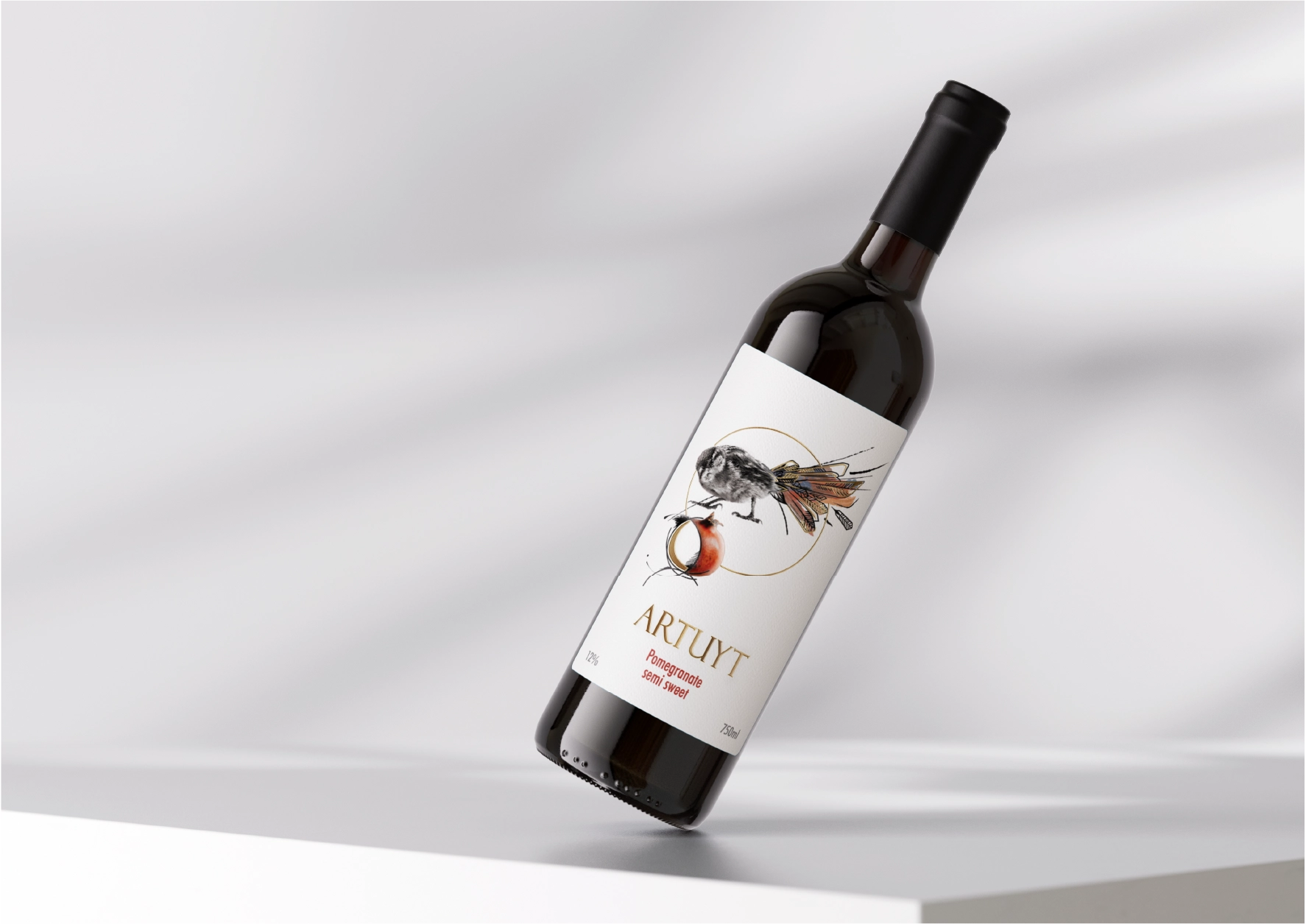
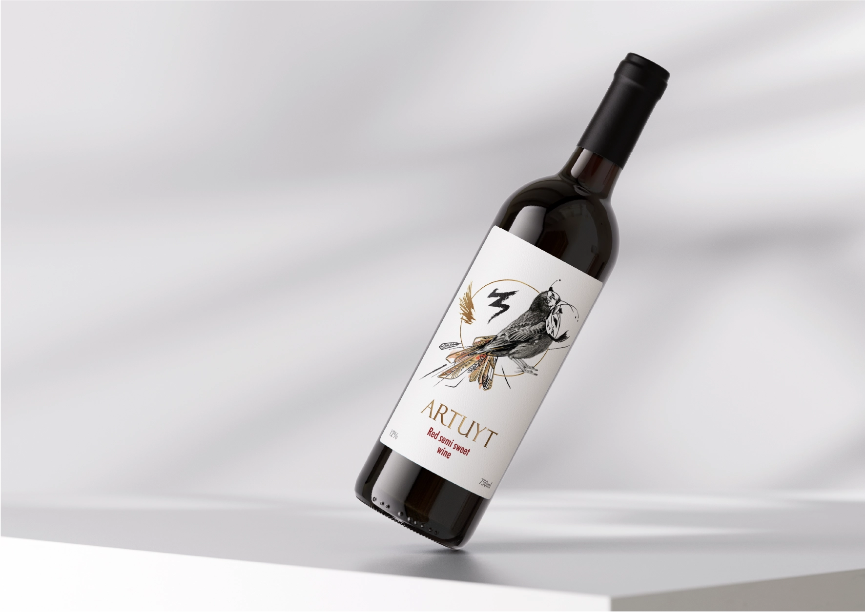
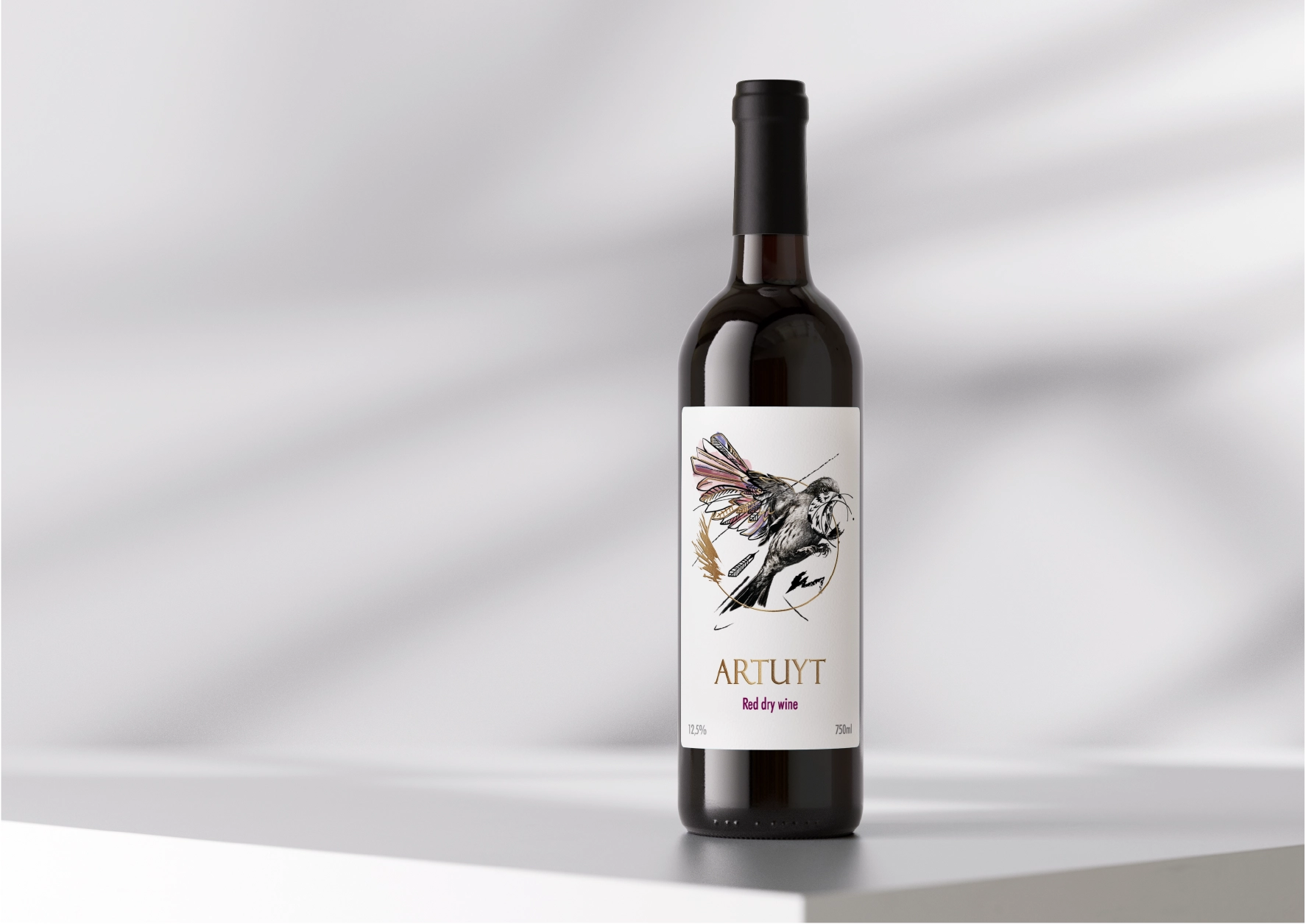
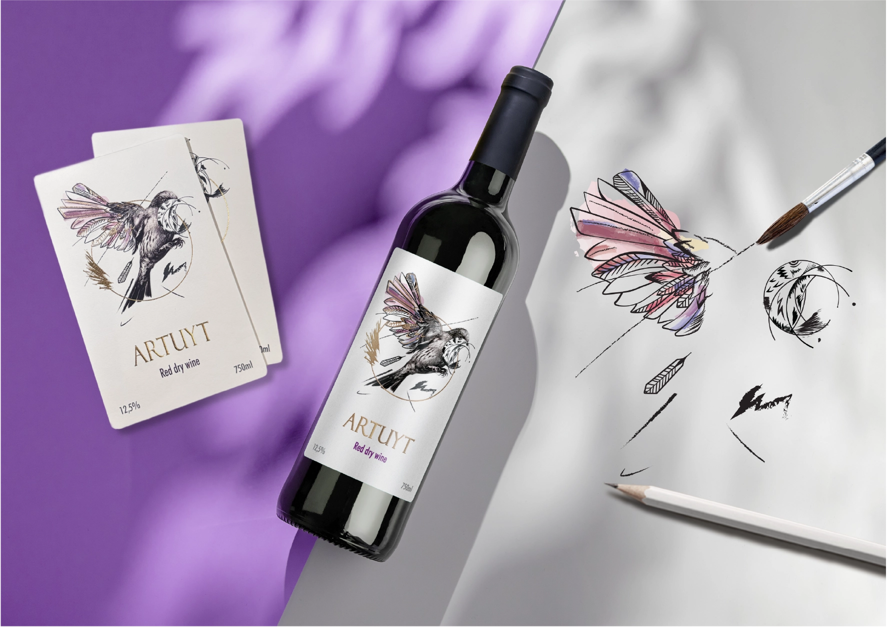
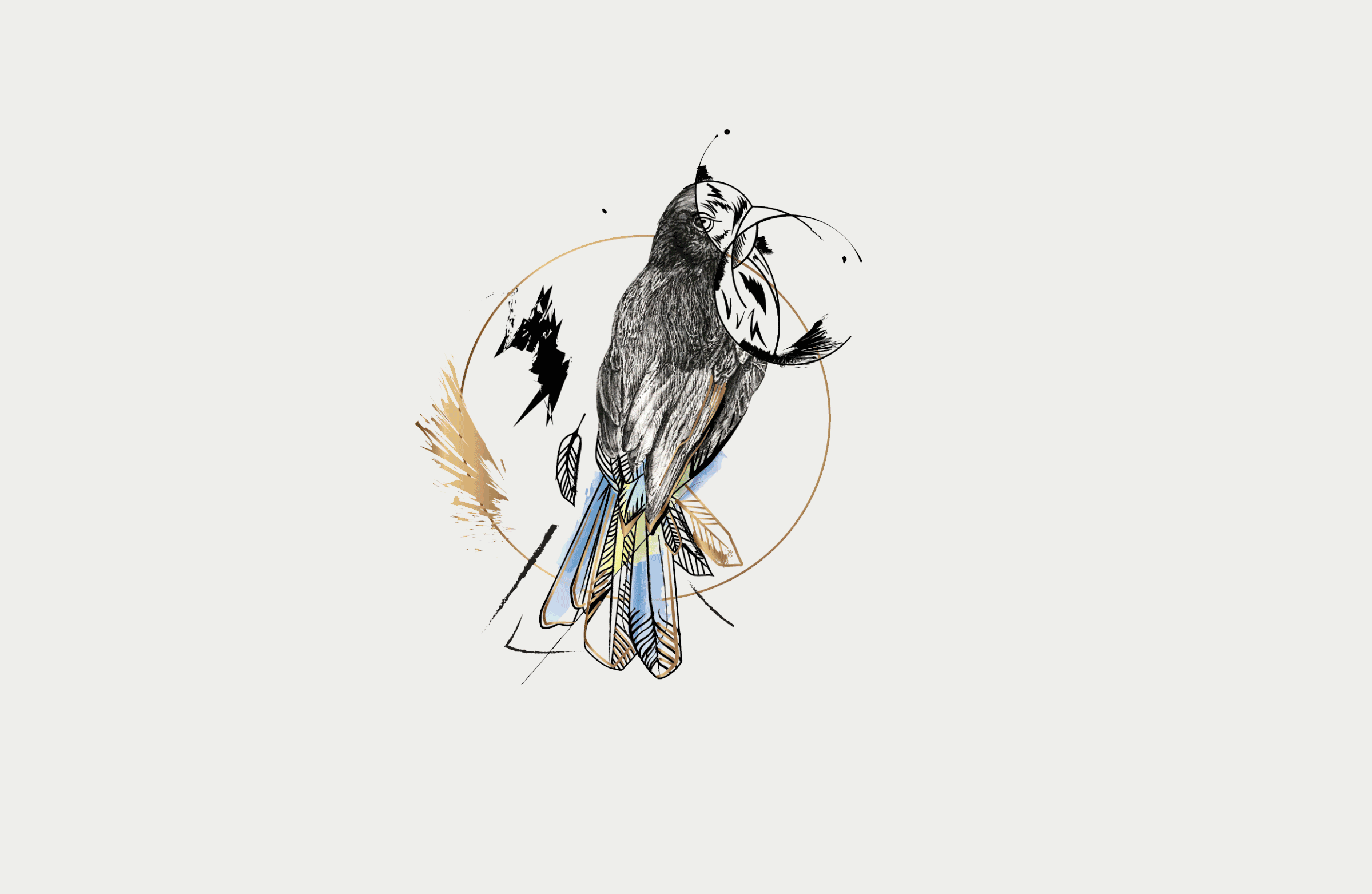
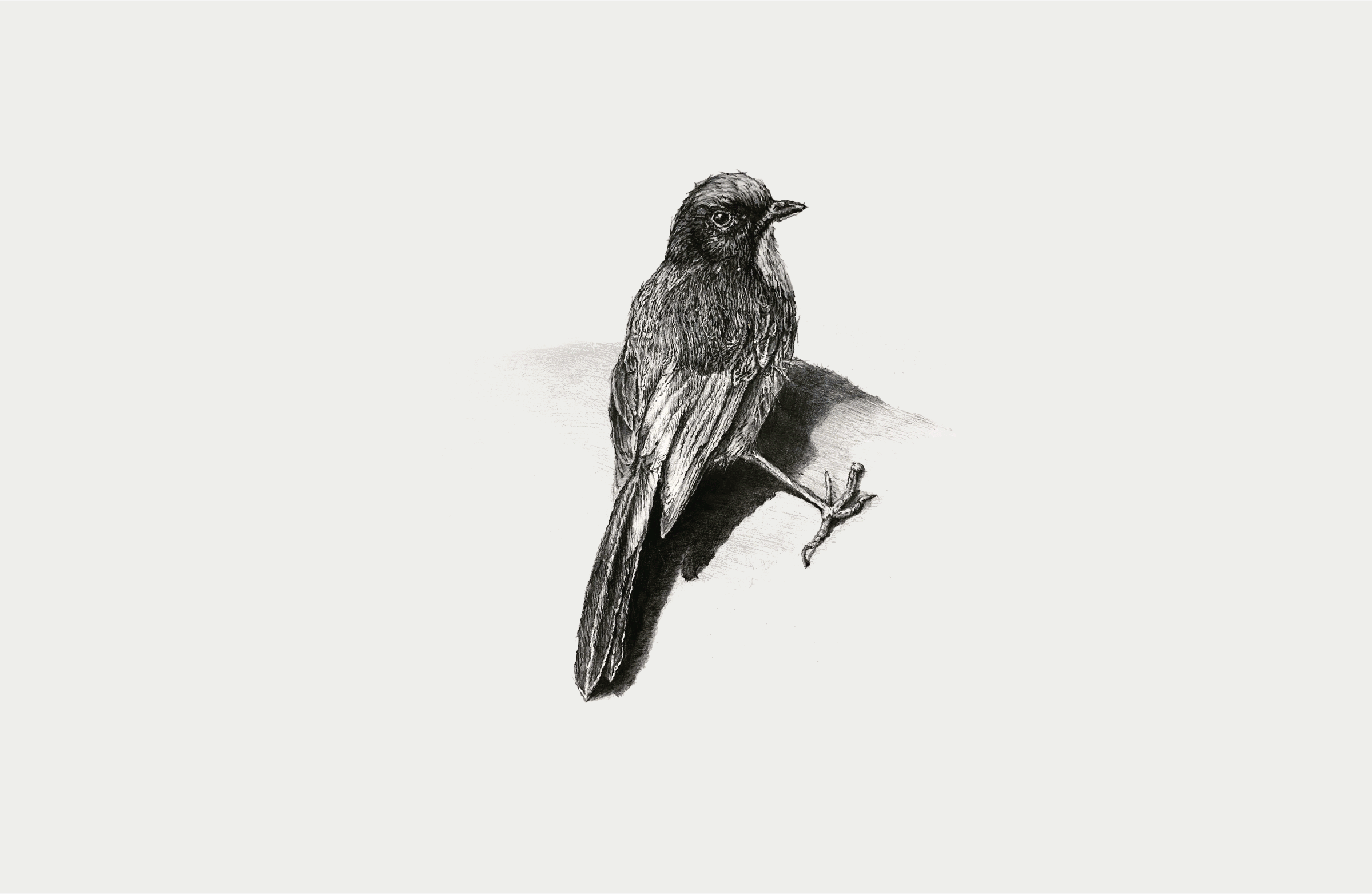
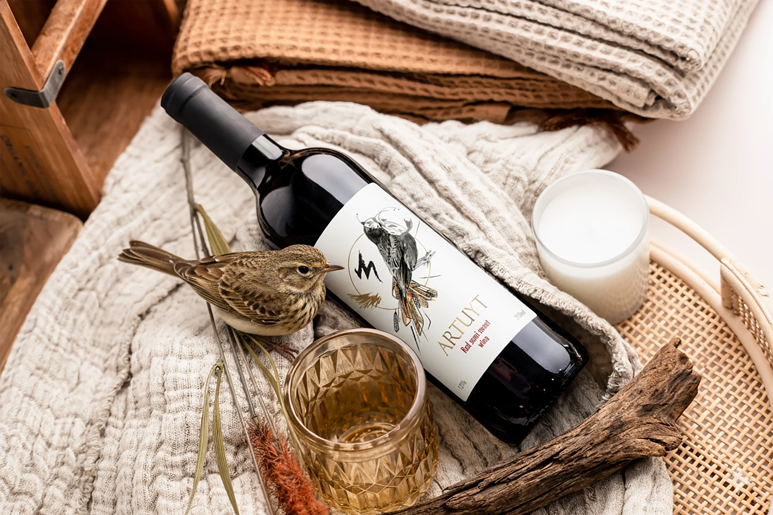
LOADING
00
Project Header Image
Label Design

Artuyt

Client MAP Company
Year 2025
Industry Wine Factory
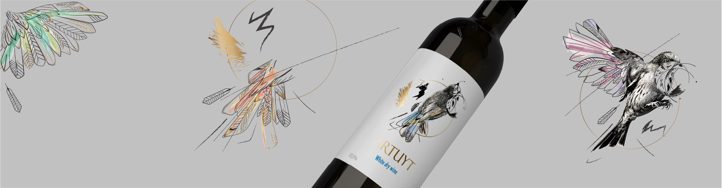
The ARTUYT wine label merges real photography with hand-drawn and watercolor art, creating a refined balance between reality and imagination. A lark, symbolizing freedom and lightness, becomes the central motif framed by a golden circle. The minimalist white background enhances purity, while delicate gold foil details add elegance. Subtle typography complements the artwork’s organic flow, reflecting ARTUYT’s vision of merging fine art and contemporary design into timeless harmony.
Single Image
Single Image
Single Image
Single Image
ABOUT PROJECT

The materials and textures were chosen carefully to enhance the overall aesthetic.

The label is printed on premium textured paper that enhances the tactile experience and highlights the natural tones of the watercolor artwork. Subtle embossing adds depth to the lark illustration and the golden circle. Gold foil accents catch the light, emphasizing elegance without excess. The combination of matte coating and selective glossy varnish (spot varnish) creates a refined contrast, reinforcing the bottle’s sophisticated and artistic character.
Single Image
Single Image
Motivation

Motivation

The design draws inspiration from the harmony between nature and artistry. The lark symbolizes freedom, light, and the joy of creation — values deeply connected to the ARTUYT philosophy. By merging photography with hand-drawn and watercolor techniques, the concept celebrates the union of the real and the imagined. The golden circle represents balance and continuity, turning the label into a poetic reflection of beauty, craftsmanship, and creative spirit.
Single Image
PROJECT FOR

The Wine Brandy Factory of Hoktemberian was founded in 1942 in the village of Lenughi. After privatization in 1995, it was renamed MAP CJSC.

Single Image